TL;DR (Too Long; Didn't Read)
- The First Impression: Your grid is your literal digital shopfront. A messy grid screams amateur, while a planned aesthetic builds instant trust, credibility, and brand authority.
- Visual Strategy: You must choose a strict palette, a consistent typography style, and a specific grid layout (like a chequerboard or vertical line structure) to create instant visual recognition.
- Content Balance: You need to learn how to integrate static photos seamlessly, short-form reels, and multi-slide educational carousels without breaking your grid's visual harmony. Cover photos play a crucial role in this process.
- Efficiency: Stop posting daily. Use batch content creation days and visual planning apps to preview your entire month of content in one sitting.
- The Conversion Engine: Transitioning from purely visual aesthetics to actual bankable revenue requires driving high comment volume. Use safe, top-tier tools like InstantDM to automatically turn those comments into private leads and direct sales while you sleep.
Introduction
An Instagram feed planning strategy is the comprehensive process of visually organising, scheduling, and optimising your profile's grid layout long before you hit the publish button. It involves carefully selecting a colour palette, structuring a cohesive visual layout, and combining that aesthetic appeal with aggressive, high-converting marketing tactics.
Welcome to the chaotic, highly competitive social media landscape of 2026. If you have been paying attention, you already know that the rules have fundamentally shifted. Five years ago, you could get away with posting a grainy, unedited photo of your morning coffee, slapping a few random hashtags on it, and watching the likes roll in. Those days are permanently over. Today's users demand a curated, premium experience. When a potential follower, client, or customer lands on your profile, your grid has exactly three seconds to communicate who you are, what specific value you offer, and why they should care enough to click the "Follow" button.
Relying on spontaneous, fly-by-the-seat-of-your-pants posting is a guaranteed recipe for stagnant growth. If you want to rank in the top percentage of creators or brands this year, you have to treat your Instagram grid like a high-end digital storefront. This ultimate guide is going to walk you through the exact, step-by-step process of transforming your scattered, random photos into a deliberate, beautiful machine that not only stops the scroll but actively converts casual lurkers into paying customers.
Consistent growth on social media requires more than just maintaining a regular posting schedule; every piece of content needs a specific, measurable objective. As detailed in this breakdown of how to plan Instagram content for growth, establishing a clear weekly goal—such as driving new email subscribers or promoting a specific lead magnet provides the strategic focus necessary to stop endlessly guessing what to post. By deliberately designing your Reels and carousels around a central call-to-action, you seamlessly connect your creative output directly to your automated direct messaging workflows, capturing inbound leads while you focus on scaling your business.
1. Why Your Instagram Feed is Your Digital Storefront
Let's break down the actual user journey in 2026. When a new user discovers your content—perhaps through a Reel that went semi-viral on the Explore page, or a carousel that a friend sent them in a direct message—their very next step is almost always to tap your profile picture. They want to see what else you have to offer.
What they see in those first critical seconds dictates everything.
The Psychology of First Impressions
Think about how you shop in the physical world. If you walk past a retail store and the window display is a chaotic mess of mismatched clothes, harsh fluorescent lighting, and handwritten, sloppy sale signs, you keep walking. Your brain immediately associates the mess with low quality. But if you walk past an Apple store, the minimalism, the clean lines, and the intentional lighting immediately tell your brain, "This is premium. This is expensive. This is trustworthy."
Your Instagram feed serves the exact same psychological purpose in the digital space. If a user lands on a profile with harsh, mismatched lighting; inconsistent fonts on graphics; and a chaotic mix of blurry personal selfies and hard-sell pitches, they bounce. They hit the back button and forget you exist. Conversely, a cohesive, beautifully planned grid signals authority, deep care, and high quality. It tells the user that you take your brand seriously, which implies you will take your customers very seriously.
Communicating Your Value Proposition Visually
Your feed planning strategy goes way beyond just making things "look pretty". It is about high-level visual storytelling. Your grid should convey your message before your audience even reads your bio.
If you run a high-end luxury skincare brand, your feed should breathe minimalism, soft beige tones, and elegant serif typography. If you run a disruptive fitness coaching business, your feed should use bold, high-contrast colours, gritty textures, and dynamic, action-orientated graphics. Before they read a single caption, your planned grid should subconsciously scream exactly what industry you are in and what specific vibe you represent.
Driving consistent revenue from your social channels requires matching your content format to the exact stage of your marketing funnel. As outlined in this ultimate guide to Instagram content strategy, strategically assigning formats like viral Reels for top-of-funnel reach and interactive Stories for mid-funnel engagement ensures you are intentionally guiding your audience toward a conversion. Aligning your daily posting habits with these specific algorithmic goals is the most effective way to keep your automated messaging sequences filled with highly qualified prospects.
2. Defining Your Visual Identity and Color Palette
A stunning grid is not a coincidence. You cannot just guess your way into a good aesthetic. Before you even think about planning your next post, you must sit down and define the visual guardrails that will keep your content cohesive over the coming months and years.
Selecting Your Brand Colors
Your colour palette is an absolute anchor for your entire visual identity. You shouldn't use every colour of the rainbow unless that chaotic, maximalist energy is a deliberate brand choice. You need to select one-to-two dominant colours and two-to-three secondary accent colours.
You need to understand basic colour psychology:
- Warm Tones: Reds, oranges, yellows, and warm browns evoke cosiness, high energy, urgency, and approachability. This palette is great for food brands, fitness coaches, or highly energetic personalities.
- Cool Tones: Blues, greens, slate greys, and stark whites evoke intense professionalism, calm, trust, and cleanliness. This colour scheme is the go-to palette for tech companies, B2B service providers, and medical aesthetics.
Stick to your chosen palette religiously. Write down the exact hex codes. If a photo you take does not naturally fit these colours, you must use editing presets to get the hues in alignment with your brand. If you have a blue feed and suddenly post a neon orange graphic, it will ruin the flow for weeks.
Typography and Graphic Styles
If you regularly post quotes, infographics, or educational carousels, your typography must remain ruthlessly consistent. Using a delicate, romantic script font on a Monday and a blocky, aggressive neon font on a Wednesday creates visual whiplash for your followers.
Choose one specific header font and one body text font. Keep your text alignment and graphic borders uniform. If you use a thin white border around your graphics, use it every single time. This creates instant brand recognition. When someone is scrolling fast through their feed, they should know a post is yours before they even look at the username.
Establishing Photography Rules
Are your photos bright and airy? Dark and moody? High contrast with deep shadows? You need to define your lighting and editing style. Additionally, it would be beneficial to determine your subjects early on: Will you feature human faces heavily to build a personal connection, or will you rely entirely on flat-lays, product shots, and architectural angles? Setting these strict rules makes your feed planner process infinitely easier down the line because you eliminate the guesswork.
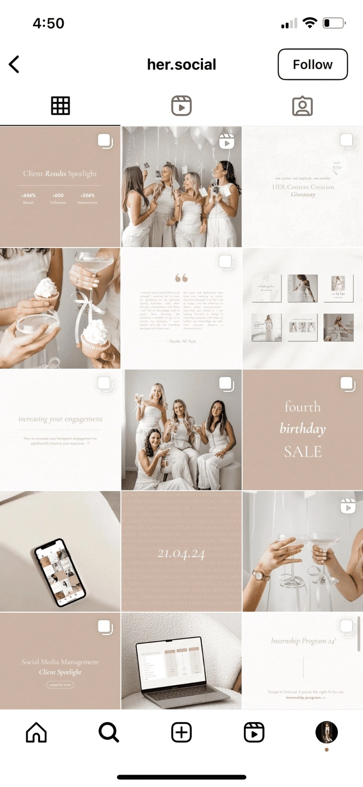
3. Grid Layout Strategies That Capture Attention
Once you have your colours, fonts, and photography rules defined, you have to decide exactly how those images will sit next to each other in the profile. The grid is essentially a nine-square puzzle, and there are several proven structural layouts you can adopt to Make it look intentional.
Popular Grid Layouts Compared
| Layout Style | How It Works | Best Suited For | The Pros | The Cons |
|---|---|---|---|---|
| Checkerboard | Alternating strictly between two distinct post types (e.g., Photo, Quote, Photo, Quote). | Service providers, business coaches, educators, agencies. | Incredibly easy to maintain. Creates a visually striking, highly balanced mix of text and image. | It can feel slightly rigid and predictable over a long period of time. |
| Vertical Lines | Keeping the middle column one specific style (e.g., text quotes) and the outer two columns lifestyle photos. | Brands with strong typography, authors, lifestyle creators. | Creates a beautiful, magazine-like scrolling experience when users look at your profile. | Forces you to post in very specific sequences. If you mess up, the line breaks. |
| Diagonal Lines | A specific post type shifts one space over with every new row, creating a diagonal staircase visual. | Creative agencies, artistic brands, high-end fashion. | Highly engaging, unique visual flow that keeps the eye moving across the screen. | Requires meticulous, obsessive planning to avoid breaking the diagonal line. |
| Puzzle Feed | One massive, continuous image that is split into 9 or 12 individual Instagram posts. | Big product launches, major event announcements, musicians. | Creates a massive "wow" factor when viewed on the profile page. | Individual posts often look weird and confusing when they pop up in a user's main feed out of context. |
| Color Blocking | Changing the dominant color palette every 6 to 9 posts (e.g., a blue phase, then a pink phase). | Fashion brands, seasonal e-commerce businesses. | Keeps the feed feeling incredibly fresh while maintaining overall cohesion. | Requires shooting content in massive, color-coordinated batches months in advance. |
Choosing the Right Layout for Your Industry
You have to match the layout to your business model. An e-commerce brand heavily reliant on showcasing different product features might benefit most from Color Blocking. They can dedicate an entire month to a specific product's aesthetic, then switch it up. A B2B business coach, however, needs to educate their audience constantly. For them, the Checkerboard layout is perfect because it allows them to alternate between a professional headshot to build trust and a high-value text graphic to deliver education.
4. The Perfect Mix: Balancing Carousels, Reels, and Static Posts
In 2026, we have to acknowledge a hard truth: Instagram is no longer just a square photo-sharing app. It is a highly complex multimedia platform. However, the aggressive rise of short-form video content has completely ruined many beautifully planned grids because creators simply forget to account for how videos look when they are forced into a square grid format.
Designing Reels Covers for the Grid
This is the cardinal rule of modern Instagram aesthetics: Never, under any circumstances, let Instagram auto-select a frame from your Reel to serve as the cover image on your grid.
If you do this, the cover will almost certainly feature you caught mid-sentence with your mouth open, blurry lighting, and absolutely no context. It will instantly destroy your carefully planned aesthetic. You must always design a custom cover graphic or take a specific still photograph during your video shoot that matches your current color palette and grid layout. When a user is scrolling your profile, they shouldn't immediately be able to tell which post is a video and which is a photo just because one looks terrible. The aesthetic quality should be identical across all formats.
The Power of Educational Carousels
Carousels are the absolute engagement machines of the current algorithm. When planning them into your feed strategy, treat the very first slide (the cover) as the primary piece of your grid puzzle.
The subsequent slides within the carousel can deviate slightly in their layout, provided they still strictly maintain the brand colors and typography rules you set up in Section 2. Ensure the cover slide has an aggressive, scroll-stopping text hook but still looks visually pleasing and uncluttered when sitting next to a lifestyle photo on your main profile.
5. Batching Content to Maintain Visual Consistency
The biggest secret to maintaining a flawless feed is entirely behind the scenes. The secret is that top creators are not waking up, taking a photo, editing it, and posting it every single day. That is exhausting, and it leads to a messy grid. The secret is batch creation.
When you shoot content sporadically throughout the month, the natural lighting changes, your outfits change, the weather changes, and the overall vibe shifts dramatically. You end up with a grid that looks like a scrapbook instead of a magazine.
The Ultimate Batch Shoot Day
You need to plan a single day (or weekend) a month dedicated entirely to content creation. Let's look at how to structure this:
- Location and Lighting: Shoot in the same location or during the exact same time of day. If you shoot at golden hour on a Tuesday, your photos will look warm. If you shoot at noon under harsh clouds on a Thursday, they will look cool and grey. Batch shooting ensures the natural light matches perfectly across 15 to 20 different photos.
- Wardrobe Planning: Bring five to six different outfits to your shoot that specifically complement your brand's defined colour palette. Change your shirt, change your jacket, but keep the colours on-brand.
- Prop Consistency: Use the exact same coffee mugs, desk accessories, laptops, or background textures to tie the photos together subtly. These tiny details are what make a grid look truly premium.
Editing in Bulk
Once the photos are taken, do not edit them one by one over the coming weeks. Load them all into your editing software at the same time. Apply your chosen preset or custom filter to all of them at once. Bulk editing is the only way to ensure the contrast levels, highlights, shadows, and colour temperatures are identical across the board, giving your grid a highly desirable, seamless aesthetic.
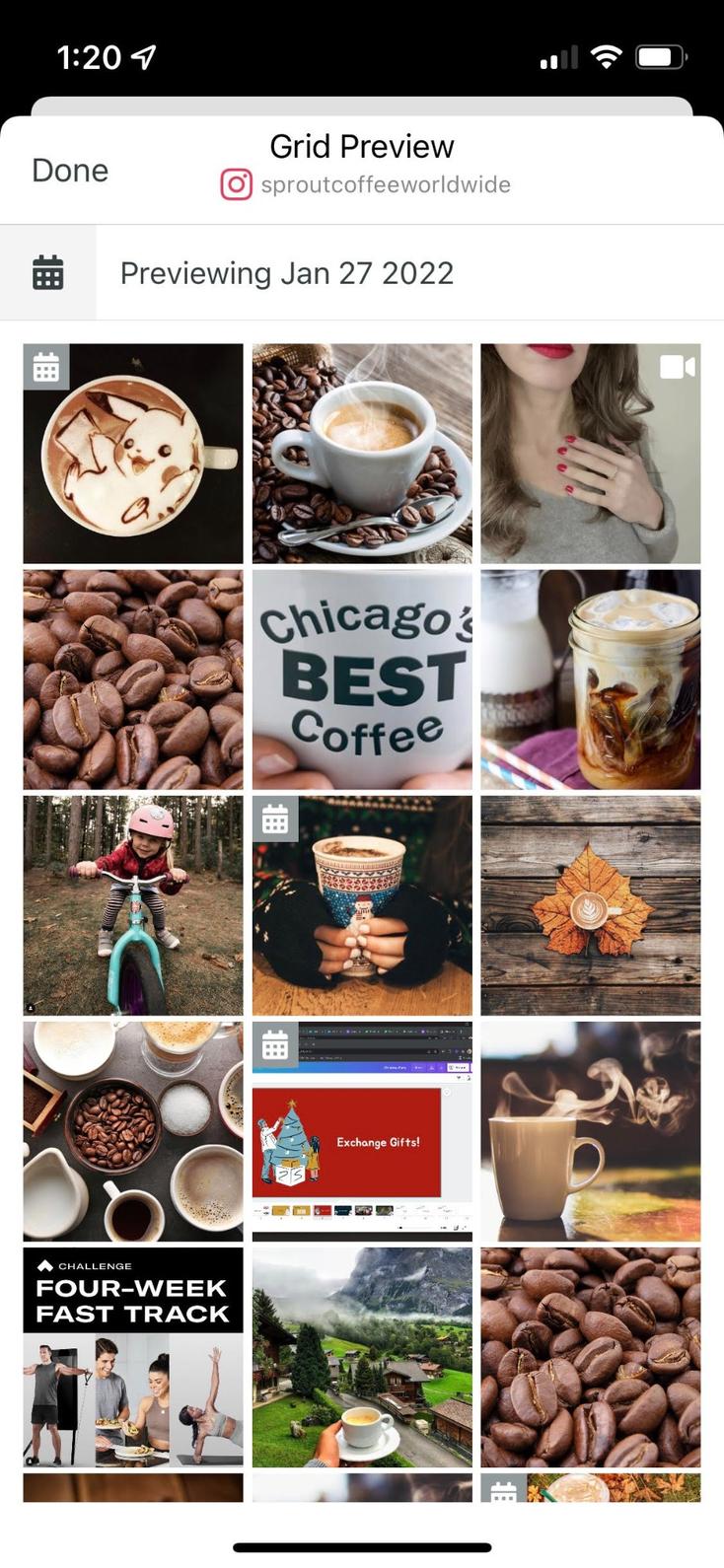
6. Top Visual Planning Apps to Preview Your Grid
You absolutely cannot plan a stunning, cohesive grid in your head. It is impossible to envision how nine different images will interact with each other without actually seeing them together. You need software to visualise your profile's future. A feed planner app is your digital sandbox.
The Magic of Drag-and-Drop
Visual planning apps allow you to upload your entire batch of edited content and literally drag the images around your screen to see how they will look side-by-side before you ever hit the publish button.
Why is this important? Because visual weight matters. If you accidentally place two highly complex, busy photos right next to each other, that section of the grid will look incredibly cluttered and overwhelming. A preview app lets you spot this traffic jam instantly. You can then swap one of those busy photos for a minimalist, clean text graphic with plenty of negative space to give the viewer's eye a place to rest.
Key Features to Look For
When choosing a feed planner to manage your strategy, you want to look for tools that offer specific workflow upgrades:
Grid Preview: The core drag-and-drop interface is non-negotiable.
Multi-Account Management: This is crucial if you manage a personal brand and a separate business page, or if you run an agency.
Caption Saving: The ability to draft, edit, and save your long-form text alongside the visual preview.
Auto-Publishing: The ability to set the post for a specific time and completely walk away from your phone, knowing the software will push it live automatically.
Capturing a high-intent lead starts the exact second a prospect lands on your profile. As detailed in this , the cohesive design of your grid—from subtle color transitions to strategic vertical layouts—dictates whether a casual browser clicks follow or bounces entirely. By optimizing this split-second visual impression, you ensure maximum profile retention, ultimately driving more organic traffic toward your call-to-action posts and feeding your automated messaging workflows.
7. Crafting Captions That Match Your Visual Vibe
A beautiful, highly curated feed is what draws them in, but the caption is what actually keeps them there. You can have the most breathtaking photography in the world, but if your captions are boring, confusing, or completely off-brand, you will lose the audience's trust. The text and the user's screen must match perfectly.
Tone and Voice Consistency
Think about the psychological disconnect of mismatched tones. If your visual aesthetic is dark, moody, artistic, and highly sophisticated, a caption filled with twenty hyper-enthusiastic emojis, slang words, and exclamation points will feel incredibly jarring to the reader. It breaks the illusion. You have to align your brand voice with your visual identity. If the grid looks professional and sleek, the copy needs to read as professional and authoritative.
Copywriting Frameworks and SEO
In 2026, Instagram SEO is just as important as the visual. The platform's search engine crawls your captions to understand what your account is about. You must use industry-specific keywords naturally within your caption so your carefully planned content is actually searchable by new users.
Furthermore, you have to format your text. A beautiful grid shouldn't lead to a terrifying, unreadable wall of text in the caption. Use copywriting frameworks like Hook, Story, Value, Call-to-Action. Break up your paragraphs. Use line breaks, bullet points, and strategic spacing to make the text as scannable, clean, and visually pleasing as the grid itself. Establishing instant credibility with your top-of-funnel audience requires a meticulously organised profile layout. As demonstrated in this ultimate guide to transforming your Instagram feed with a visual planner, utilizing advanced scheduling software allows you to seamlessly preview exactly how your live and upcoming content will appear side by side. Maintaining this level of strict aesthetic control ensures that every new profile visitor immediately recognises your brand's authority, drastically increasing the likelihood that they will engage with your call-to-action posts and enter your automated message funnels.
8. Timing is Everything: Scheduling for Maximum Reach
A beautifully planned grid is completely useless if nobody is awake to actually see it. Feed planners are not just about making things look pretty; they are serious logistical lifesavers for busy business owners.
Training the Algorithm
The Instagram algorithm heavily favours consistency above almost everything else. If you post randomly—dumping three photos on a Tuesday afternoon and then completely ghosting the app for a week and a half—the algorithm punishes you by throttling your reach. It wants creators who keep people on the app predictably.
By using a feed planner to schedule your posts at the exact same times every single week, you actively train the algorithm to expect your content. When the algorithm knows your schedule, it leads to much more reliable delivery to your followers' feeds.
Finding Your Prime Time
You have to dive into your Instagram Insights to determine when your specific audience is actually holding their phones. If your demographic consists of busy working professionals, scheduling a massive, high-value educational post for 10:30 AM on a Wednesday is likely a complete waste of your hard work. They are in meetings. Schedule your visually planned posts for the exact hours when your audience is actively commuting, on their lunch breaks, or scrolling mindlessly in the evening before bed.
9. Using Grid Analytics to Pivot Your Content Strategy
Planning your feed is a constantly evolving process. You cannot just set a strategy in January and blindly follow it until December without looking at the numbers. What looked absolutely incredible in your preview app might completely flop with your actual audience. You must use hard data to inform your next batch-creation day.
Metrics That Actually Matter
You have to stop obsessing over likes. In modern Instagram marketing, likes are a vanity metric that tell you almost nothing about the health of your business. The true indicators of a successful grid post are entirely different today:
- Saves: This number indicates that the content was highly valuable, educational, or inspiring. When someone saves a post, they are telling the algorithm, "I want to come back and look at this content later." This is the ultimate goal for carousels and infographics.
- Shares: This indicates that the content resonated emotionally, was highly entertaining, or validated a belief they hold. Shares are the key to viral growth.
- Profile Visits: This metric indicates that the specific post was compelling enough to make a non-follower want to click through and see the rest of your beautiful grid.
Look at your data objectively. If your chequerboard layout consists of photos and text quotes, and the data clearly shows your quotes get zero saves but your lifestyle photos get massive engagement, you have to kill your darlings. It is time to pivot your grid strategy away from the chequerboard and lean heavily into what the data says actually works.
 Shopify integration, designed for Meta-compliant messaging in 2026.">
10. From Aesthetic to Action: Driving Comments from Your Grid
This section is where we transition from having a "pretty" vanity page to having a highly profitable business page. While aesthetics are important for building trust, they alone do not generate revenue. Actions build revenue. And in 2026, the most valuable action a user can take on a grid post is leaving a comment.
The Psychology of the Keyword
Every single post you plan for your grid needs a hyper-specific call to action (CTA). You can never leave your audience guessing what they are supposed to do next. Ending a caption with the phrase, "Let me know your thoughts below!" will likely result in no response. It requires too much mental effort for the user to formulate a response.
Instead, you need to use keyword triggers.
- In the Graphic: If you are posting a carousel, the very final slide should explicitly tell the user to drop a specific, one-word comment below.
- In the caption: The last line of your caption should be a directive to comment a bolded keyword, like "Comment CHECKLIST to get the free download".
When you train your audience to comment specific words on your meticulously planned visual content, you lower the barrier to entry. They don't have to think; they just type the word. This signals to the algorithm that your page is highly engaging, which skyrockets your organic reach while simultaneously giving you a list of warm leads.
11. Turning Feed Engagement into Private Leads Automatically
Once your beautifully planned grid strategy starts working and you are successfully driving a massive volume of comments, you face a brand new, very stressful problem: how do you manage all that engagement? If you get 400 comments asking for your new resource, you cannot spend your entire weekend manually typing out 400 direct messages. That is a fast track to burnout. This is where the magic of automated workflows comes into play.
The Power of "Comment-to-DM" Triggers
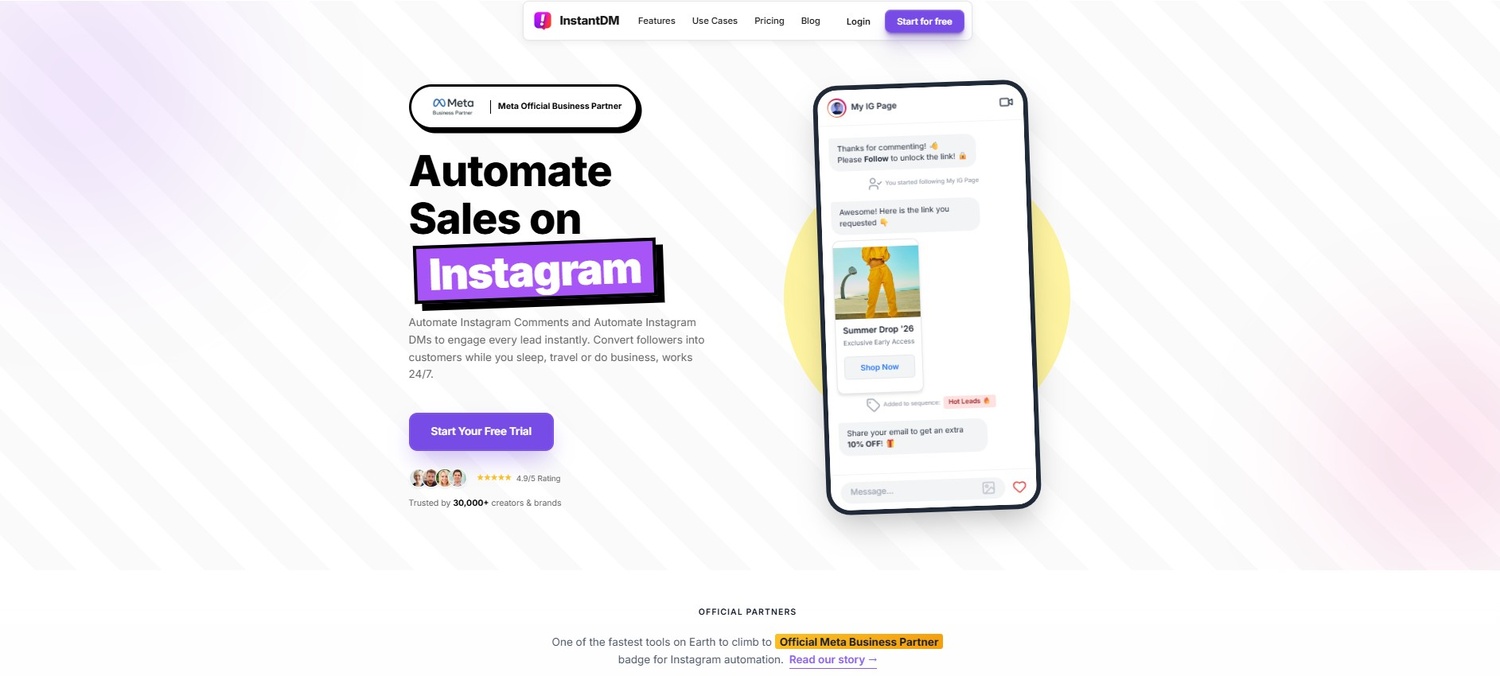
You can use backend software to handle the heavy lifting instead of manually replying to every single user who requests your new lookbook, ebook, or resource link. By setting up a "Comment-to-DM" trigger, you simply ask your followers to comment that specific keyword we talked about—like "GUIDE" or "LINK"—on your latest grid post.
Seamless Capture with InstantDM
To execute this process flawlessly and professionally, top creators and brands are utilizing tools like InstantDM. Once a follower comments your chosen keyword on your perfectly curated post, the software instantly detects it. It automatically sends a highly personalised direct message to that specific user containing your desired link, right into their inbox. It captures the high-intent traffic generated by your grid at the exact second they are most interested.
Busy creators can set up this entire workflow in just a few minutes. InstantDM features a highly visual, drag-and-drop flow builder. This means you can connect your beautiful grid to a powerful lead generation system that operates in the background without needing any complex programming skills, coding knowledge, or technical background. It just works seamlessly in the background while you focus on planning your next batch of content.
12. Scaling Feed Conversions Safely with E-Commerce Integration
For product-based businesses, boutiques, and artists, a well-planned grid is essentially a digital, highly interactive catalogue. When a follower sees a stunning, perfectly lit flat-lay of your new summer apparel collection sitting beautifully on your feed, the distance between them admiring that photo and actually pulling out their credit card to buy the product needs to be as short as humanly possible.
Direct Shopping in the Inbox
You can fully monetise your visual strategy by connecting your grid engagement directly to your actual online store. InstantDM makes this process incredibly smooth by integrating heavily with major e-commerce platforms like Shopify. When a user comments "SUMMER" on your grid post, they don't just get a boring, generic text link that they have to click. Instead, they automatically receive a dynamic, scrollable product gallery directly inside their Instagram inbox. They can browse the shirts, select their sizes, and check out with zero friction, all without leaving the app environment.
Protecting Your Account While Scaling
The biggest fear business owners have when automating their grid engagement is platform safety. If a cheap app blasts out 500 messages at superhuman speed, Instagram will instantly flag the account for spam and issue a shadowban. It is vital to use software that actively protects your digital shopfront.
InstantDM safely handles massive, viral spikes in engagement by utilizing strict, hard-coded safety rules. It simulates real human behaviour by employing staggered sending limits and randomised message delays. One message might be sent in four seconds, the next in twelve seconds. This brilliant pacing ensures your beautifully planned, high-converting profile stays completely safe, green-lit, and secure from platform penalties, no matter how viral your grid content becomes.
Converting profile visitors into captured leads requires a seamless visual experience that instantly builds trust. As outlined in this guide to creating a cohesive Instagram feed, intentionally planning your color transitions and grid layout ahead of time is essential for establishing immediate brand authority. When your profile looks professional and perfectly curated, prospects are far more likely to engage with your call-to-action content, naturally funnelling high-intent traffic directly into your automated messaging systems.
13. Keeping Your Grid Strategy Adaptable and Fresh
A strict aesthetic is vital for brand recognition when starting out, but don't trap yourself. If you do the exact same chequerboard layout with the exact same three colours for three years straight, your audience will develop banner blindness. They will stop noticing your posts because they all blend together. Your grid strategy must be a living, breathing entity.
Transitioning Colors Naturally
If you're shifting from a vibrant, highly saturated neon summer aesthetic to a moody, muted, cosy autumn aesthetic, avoid making abrupt changes overnight. The visual clash on your grid will look terrible. Instead, you need to transition. Spend the next 6 to 9 posts gradually desaturating your photos. Slowly introduce the new fall colours as tiny accents (like a burning orange coffee cup in the background) before they become the dominant theme of the entire feed. This creates a beautiful visual gradient on your profile.
Evolving with Your Brand
As your business grows, your grid should reflect that maturity. Don't be afraid to experiment with new layouts or invest in higher-end photography. If you rebrand your website, your Instagram feed needs to reflect those new fonts and colours immediately. The ultimate goal of a feed planner is to give you a structural roadmap, but you are the one driving the car. Keep previewing your ideas, keep heavily analysing the data to see what your audience actually wants, and keep refining your digital shopfront to ensure it remains a place your audience genuinely loves to visit.
Conclusion
Curating a stunning, high-converting Instagram feed is a meticulous art form heavily backed by data-driven strategy. It requires stepping far away from the habit of impulsive, emotional posting and actively embracing the mindset of a digital architect. By defining a strict visual identity, choosing a layout that actually complements your specific industry, and utilizing visual planning apps to preview your grid before the world sees it, you build a storefront that instantly commands respect and consumer trust.
But you have to remember the golden rule of modern marketing: aesthetics without action are just vanity metrics. You cannot deposit likes into a bank account. By intertwining your visual planning with aggressive, frictionless engagement tactics—like automated comment-to-DM funnels through platforms like InstantDM—you completely transform your profile. You elevate it from a simple digital photo gallery into a highly powerful, automated revenue engine. Plan your grid carefully, protect your visual vibe ruthlessly, and watch your conversions and community soar in 2026.